How to Edit Team Showcase Design with Live Builder?
TS Team Members includes a powerful Live Builder that allows you to visually customize your team showcase design with real-time previews. No coding required! Follow the steps below to edit your team design easily:
Open the Live Builder
- Go to your WordPress Dashboard and navigate to TS Team>>Team Showcase.
- Find your desired team section and click on Edit Design.

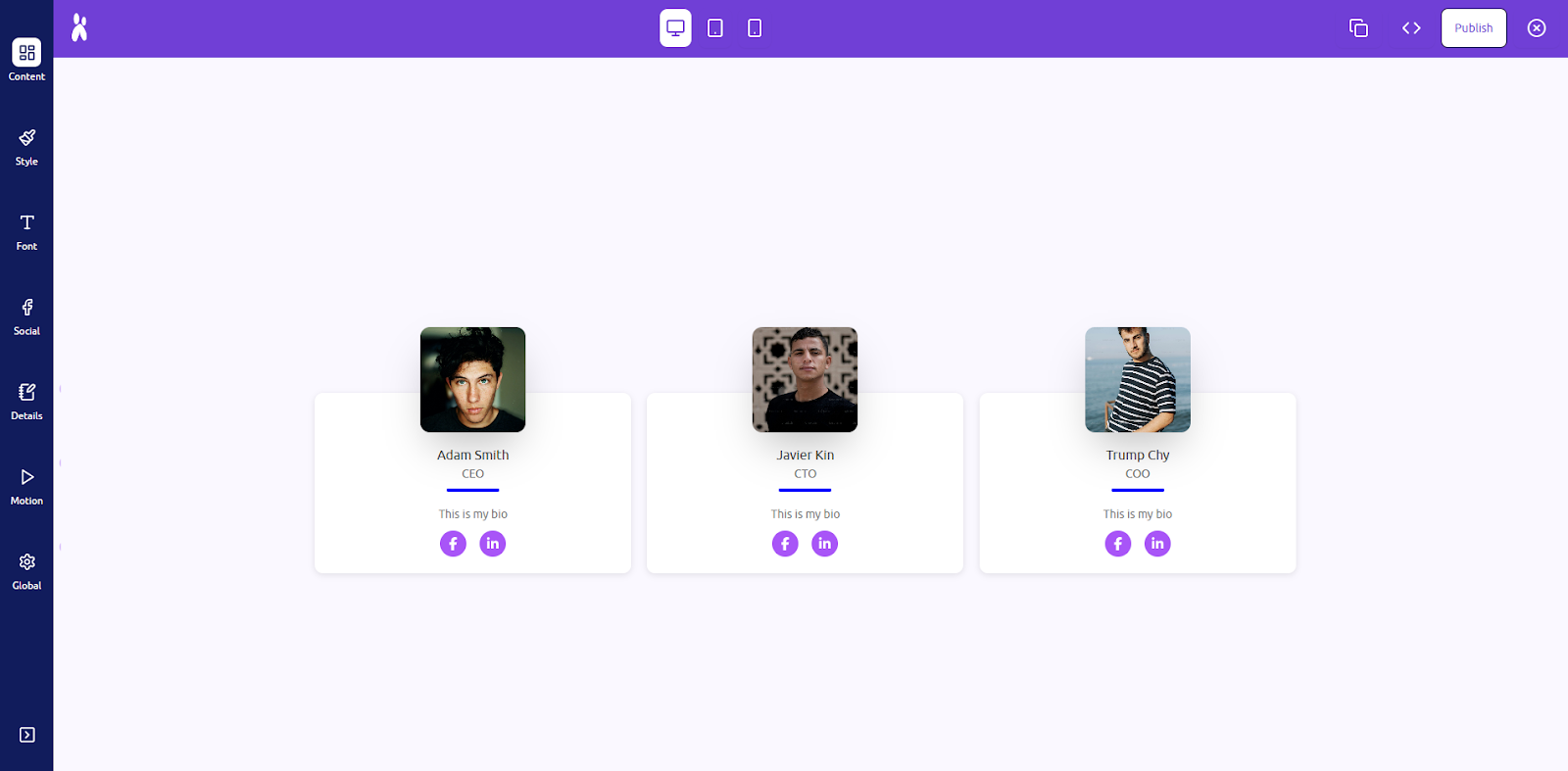
- The Live Builder interface will open, divided into multiple customization panels: Content, Common Style, Typography Control, Social, Layout Hover Animation, Global Settings etc.
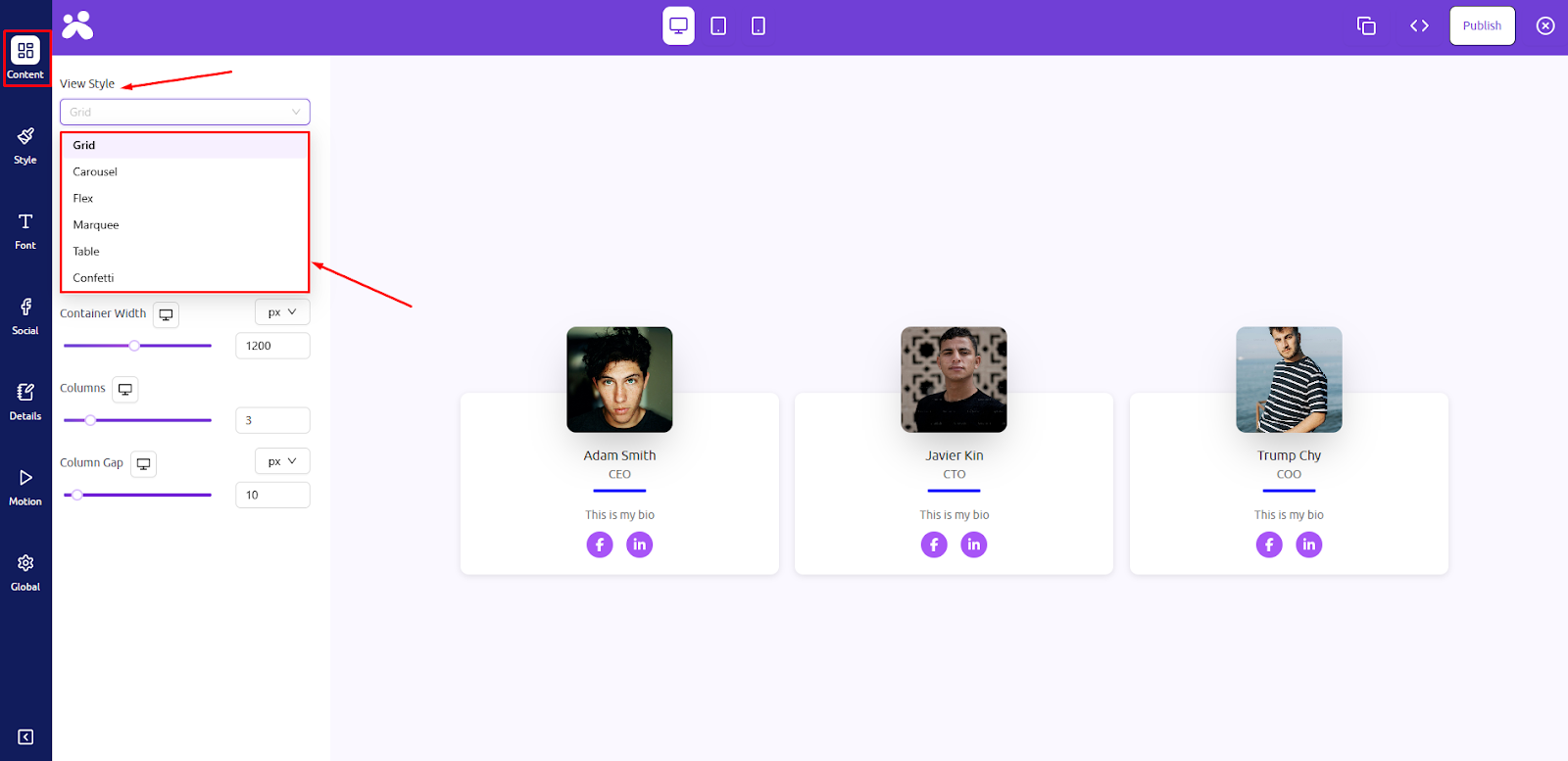
Step 1: Content Panel
Customize the layout structure and core visual style.
- View Styles: Choose how the team members are visually arranged on the page. You can select from styles like Grid, Carousel, Flex, Marquee, Table, or Confetti. Each view style presents the members in a unique design pattern suitable for different themes and use cases.
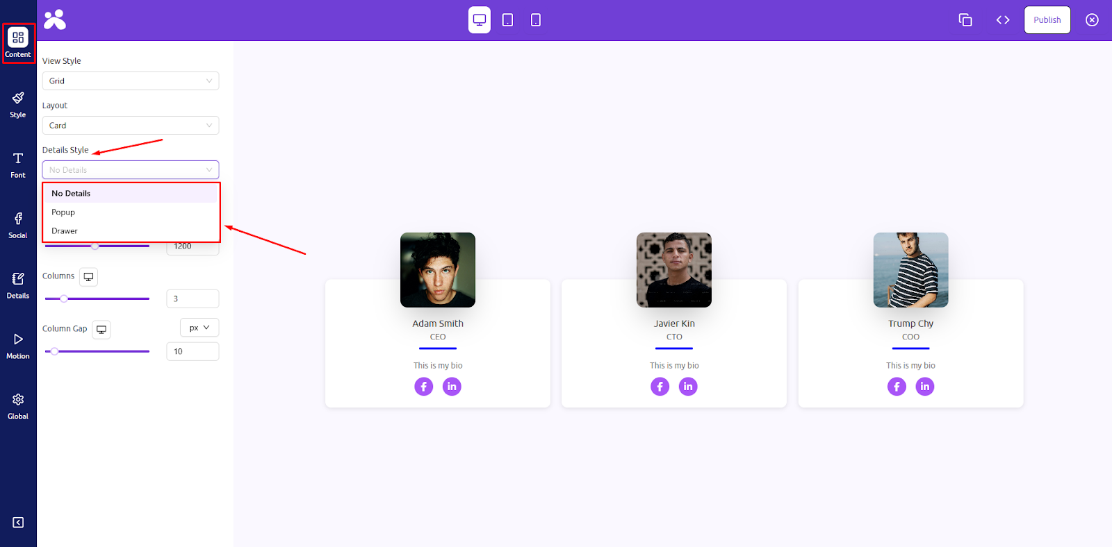
- Layouts: The layout defines the shape and arrangement of each individual team card. Options include Card, Horizontal Card, Overlay Card, Tiles, Circle Mask, Fancy Card, Glass, and Capsule Card, each offering a distinct aesthetic design.

- Details Styles: Control how detailed information (like bio or description) appears for each member. You can choose No Details to keep things minimal, or use Popup and Drawer to reveal more information in an interactive way on click or hover.
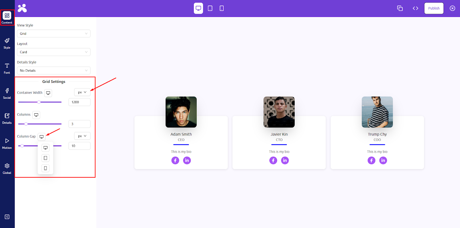
- View Style Settings: Fine-tune the visual spacing and behavior of your team layout. Adjust the width of the section, gaps between columns, and control how elements respond to hover interactions. These settings help adapt the layout to your any screen sizes.
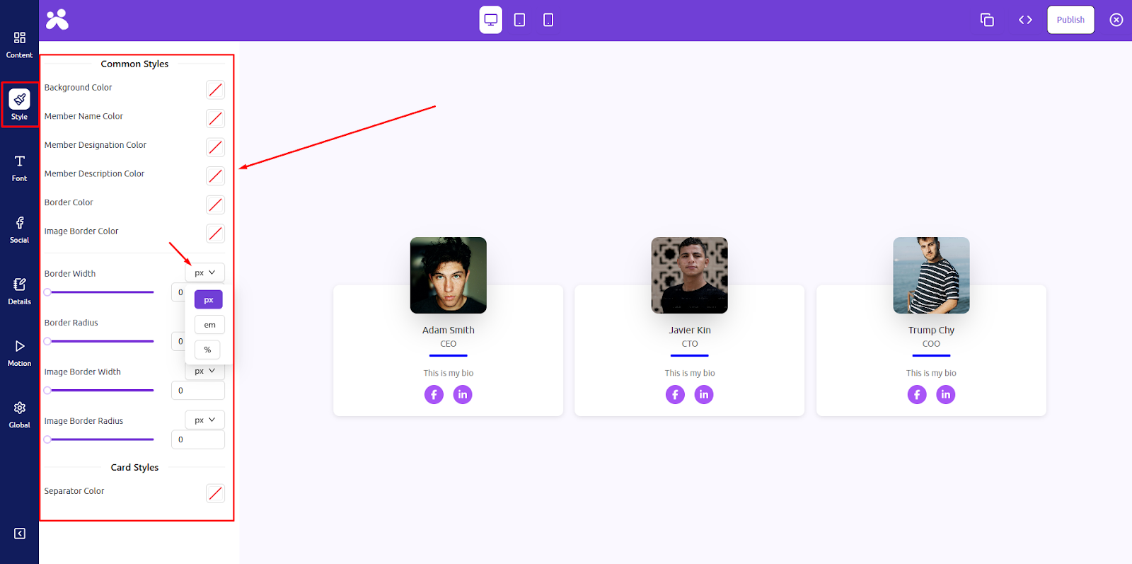
Step 2: Style Panel
Control the visual appearance of your cards and members.
- Background Color: Set the background color for each team card. This allows you to match your team section with your website’s branding or highlight each card with subtle color accents.
- Member Name Color: Change the color of the team member’s name to improve readability or match your site’s typography color palette.
- Member Designation Color: Set the color of the job title or role shown under each name. This adds hierarchy and visual balance to your team profiles.
- Member Description Color: Customize the color of the bio or description text. This ensures consistent branding and enhances the legibility of longer text blocks.
- Border Color: Apply a border color to the outer frame of each team card for stylistic emphasis or visual separation from the background.
- Image Border Color: Defines the color around the team member’s photo. You can match it with the card border or use a contrasting color for emphasis.
- Border Width: Control the thickness of the outer border around each card. This is useful for creating subtle or bold frame effects.
- Border Radius: Round the corners of your team cards using the border-radius setting. Higher values make cards look more modern and soft.
- Image Border Width: Set how thick the border around each member’s image should be. Helps define the image area and create design consistency.
- Image Border Radius: Adjust the roundness of the team member images. Use this to switch between square, rounded, or circular images easily.
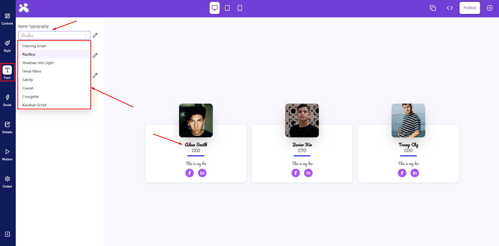
Step 3: Full Typography Control (Font) Panel
Define unique typographic styles for team content using elegant fonts.
- Name Typography: Choose from a curated list of modern and script fonts like Dancing Script, Pacifico, or Kaushan Script to give each team member’s name a distinct personality. Ideal for adding elegance or uniqueness to your design.
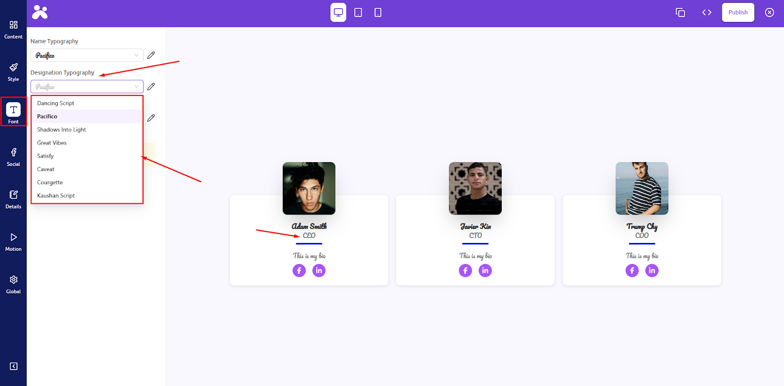
- Designation Typography: Select a specific font style for designations (roles) to differentiate them from names and ensure a clean visual hierarchy across team profiles.
- Description Typography: Customize the font for longer bios or descriptions. With font options like Caveat or Courgette, you can keep things friendly, professional, or fun depending on your brand tone.
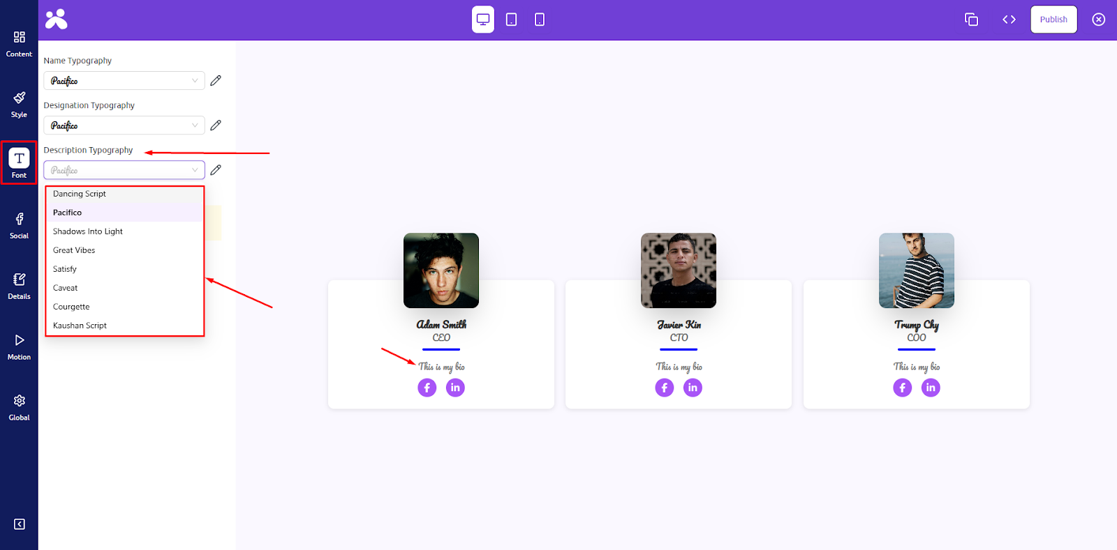
Each typography option also allows advanced controls like font size, line height, letter spacing, and weight for full styling freedom.
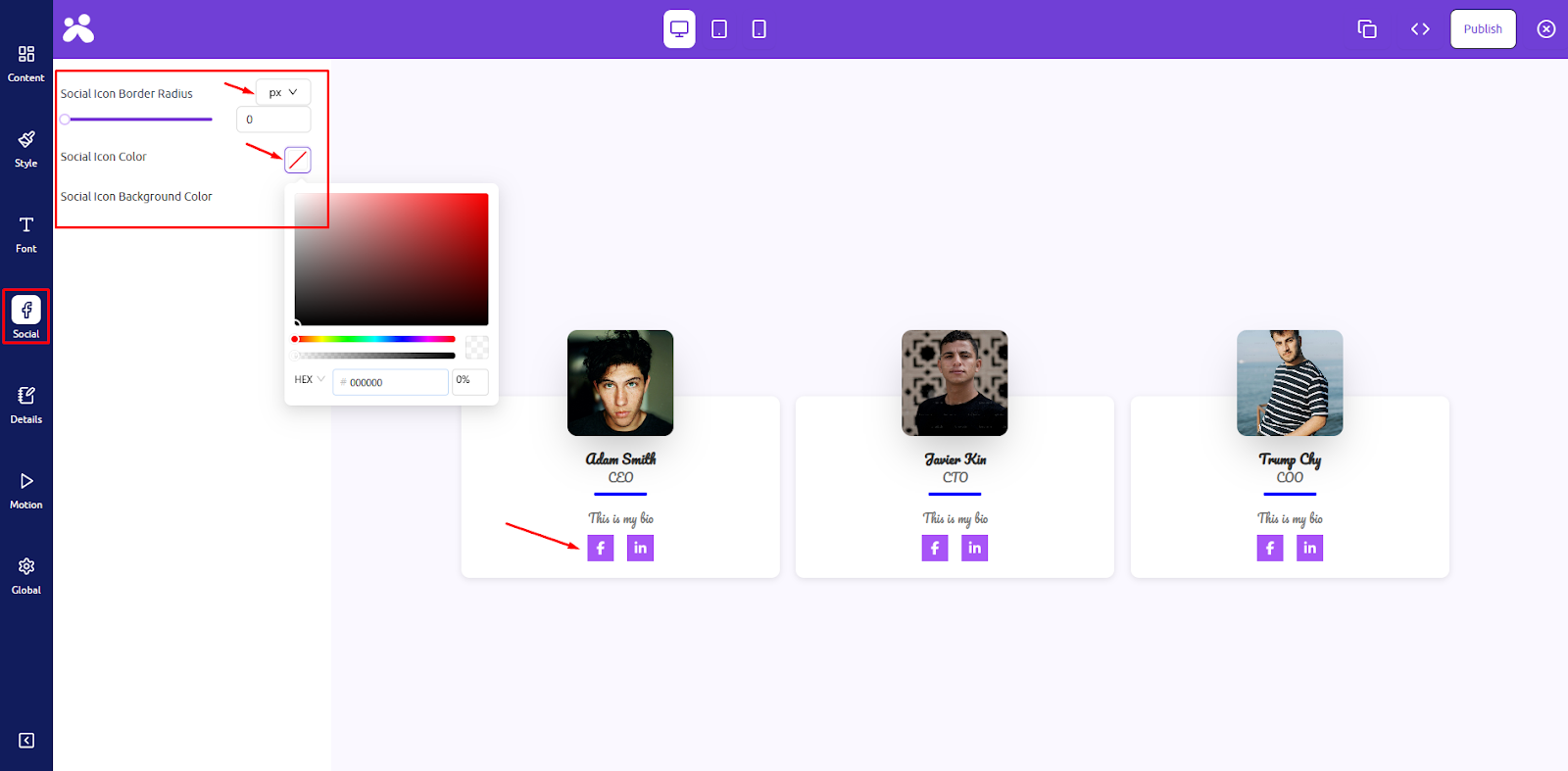
Step 4: Social Panel
Style the social media icons of each team member.
- Social Icon Border Radius: This controls how round the edges of the social icons appear. You can make them square, rounded, or completely circular to match your card design style.
- Social Icon Color: Set the default color of the icons (like Facebook, Twitter, LinkedIn). This can reflect your brand’s color scheme or adapt to your site’s design aesthetics.
- Social Icon Background Color: Set a background color behind the social icons for contrast or hover effect. Great for improving visibility or giving icons a badge-like look.
Step 5: Layout Hover Animation
Add dynamic hover effects to your team cards for enhanced user engagement. Choose from animations like 3D Float, Tilt, Blur, Slide Top, Shadow Top, and more to make your layout interactive and modern.
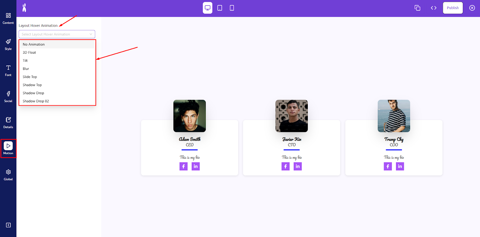
These effects add depth and motion to your content.
Step 6: Global Settings
Control container-wide layout and spacing.
- Container Background Color: Set the background for the entire team showcase container. Use a solid color or subtle shade to distinguish this section from other parts of your page.
- Container Margin: Adjust the space outside the team container. Use this to control spacing between your team section and adjacent elements or blocks.
- Container Padding: Add inner spacing within the team container. Padding ensures your team cards don’t touch the container edges and improves layout clarity.
- Container Border Radius: Set the corner roundness for the entire container section. This adds a soft, modern touch to the overall team showcase block.

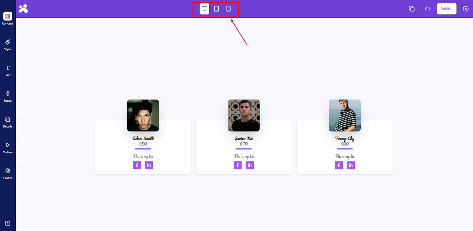
Responsive Design & Publish
- Before finalizing your showcase, it’s important to check how your design looks on different screen sizes to ensure the best user experience on all devices. In the Live Builder toolbar, switch between Laptop, Tablet, and Mobile view modes. This allows you to adjust column layout, font sizes, image scaling, or spacing specifically for each device. Ensure your text remains readable, images are well aligned, and hover effects function properly on all breakpoints.
- Once you’re satisfied with the design, then click the “Publish” button at the top-right corner of the Live Builder. Your design is now live and instantly reflected wherever the related shortcode is used.

You can revisit the Live Builder at any time to make edits and republish the updated design.